
.JPG)
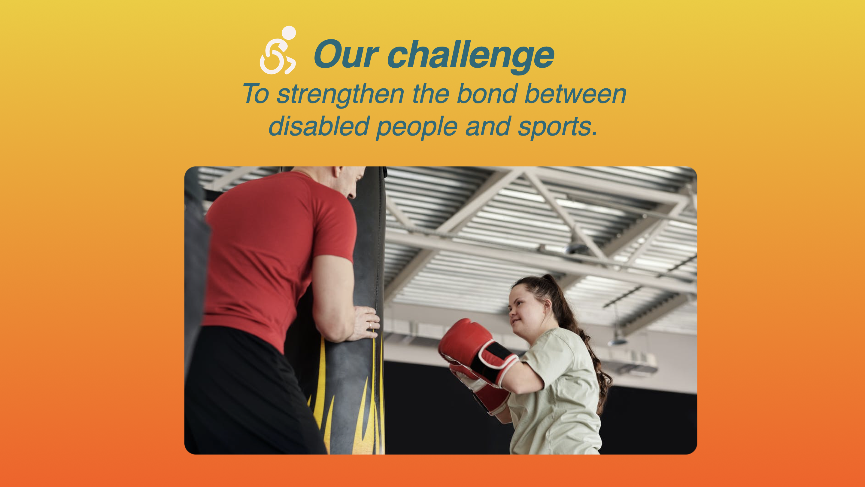
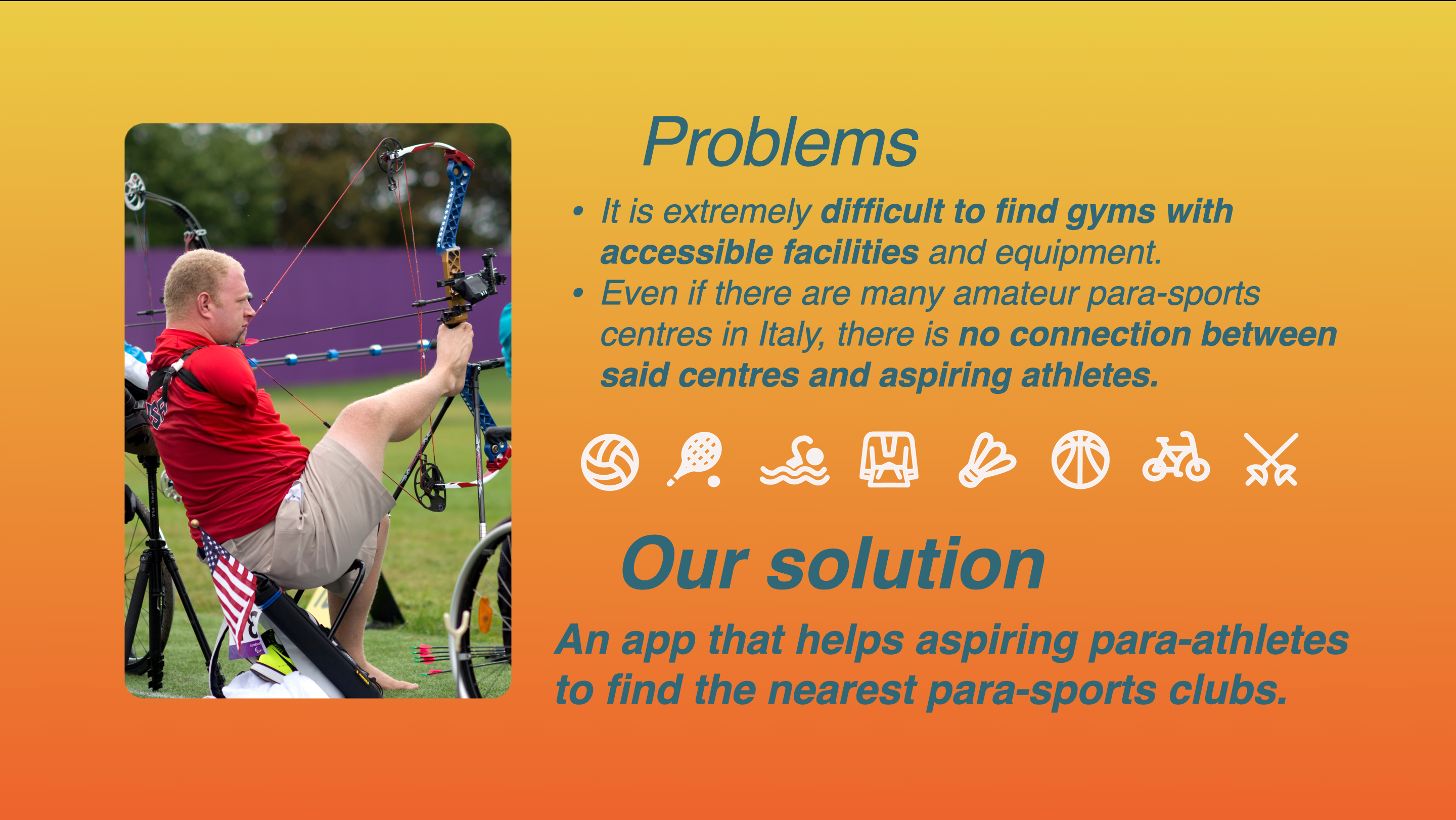
Once identified the main problems that our target users were experiencing we came with a solution that could help people with different kind of disabilities to find a para-sport club that may accomodate their needs, this reinforcing the link between people with physical impairments and sports.
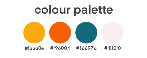
Being our app related to sports, I choose to work mainly with warm colours that may help to transmit a sense of enjoyment and vigour. For this reason I choose a warm yellow and a neon orange as base colours, with contrasting texts in Prussian blue and accents in a lower-contrast white.
The silhouette of our icon takes inspiration by Richard Whitehead , a world-famous para-athlete who holds the world record for athletes with a double amputation in both the full and half marathon. This icon is intended to challenge the commonly acknowledged static representation of disabled people, pictured as sitting still on a wheelchair ♿︎
The name for our app is also intended to promote a more active style for our target users:
adaptive sports + active = adaCtive
.png)
You may have a look of the final views that were implemented in our prototype in the following video: